
This is an ultimate guide to machine learning project for beginners based on Titanic Survival Prediction. In this project we will go through all essential and basic flow of any machine learning project for prediction. Titanic dataset is a very basic and perfect example to get started for beginners.
Overview
The task of “Titanic Survival Prediction Using Machine Learning” involves building a predictive model to determine whether passengers aboard the Titanic survived or not based on various features such as age, gender, class, and cabin. This is a classic machine learning problem often used for educational purposes and competitions.
In this task, we typically start by exploring and preprocessing the dataset, which contains information about Titanic passengers, including both survivors and non-survivors. We clean the data, handle missing values, and engineer features that may be useful for prediction. Then, we split the dataset into training and testing sets.
Next, we choose a machine learning algorithm (such as logistic regression, decision trees, random forests, etc.) to train on the training data. The model learns patterns from the features and their corresponding survival labels.
After training the model, we evaluate its performance on the testing data to assess its ability to generalize to unseen data. We use evaluation metrics such as accuracy, precision, recall, or the area under the ROC curve to measure the model’s performance. Download the dataset from here.
Project Flow and Architecture
The flow of the project is very simple as shown below. First we get the data into our editor (feel free to use any editor you want, here we are going with Jupyter).
Let’s see the high level flow first:
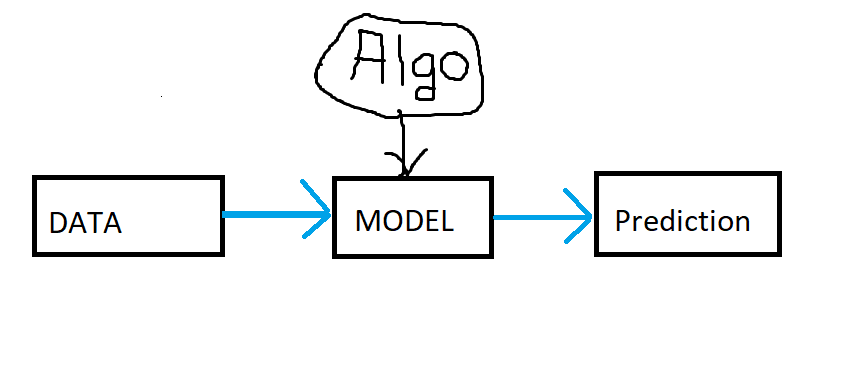
In the above diagram, as input data passes into model, the model gets created using any algorithm and then using that model the prediction can be done. Now lets see more in depth or descriptive diagram for our project work flow.

In the above image we can see the perfect flow of model building starting from data gathering to model deployment. Here model evaluation is nothing but the data prediction step.
Here is the full list of ML model flow:
- Data Gathering
- Data Preparation
- 𝗨𝗻𝗱𝗲𝗿𝘀𝘁𝗮𝗻𝗱𝗶𝗻𝗴 𝘆𝗼𝘂𝗿 𝗗𝗮𝘁𝗮
- 𝗘𝗗𝗔
- 𝗙𝗲𝗮𝘁𝘂𝗿𝗲 𝗘𝗻𝗴𝗶𝗻𝗲𝗲𝗿𝗶𝗻𝗴
- 𝗙𝗲𝗮𝘁𝘂𝗿𝗲 𝗧𝗿𝗮𝗻𝘀𝗳𝗼𝗿𝗺𝗮𝘁𝗶𝗼𝗻
- 𝘔𝘪𝘴𝘴𝘪𝘯𝘨 𝘝𝘢𝘭𝘶𝘦 𝘐𝘮𝘱𝘶𝘵𝘢𝘵𝘪𝘰𝘯
- 𝘏𝘢𝘯𝘥𝘭𝘪𝘯𝘨 𝘊𝘢𝘵𝘦𝘨𝘰𝘳𝘪𝘤𝘢𝘭 𝘍𝘦𝘢𝘵𝘶𝘳𝘦𝘴
- 𝘖𝘶𝘵𝘭𝘪𝘦𝘳 𝘋𝘦𝘵𝘦𝘤𝘵𝘪𝘰𝘯
- 𝘍𝘦𝘢𝘵𝘶𝘳𝘦 𝘚𝘤𝘢𝘭𝘪𝘯𝘨
- 𝗙𝗲𝗮𝘁𝘂𝗿𝗲 𝗖𝗼𝗻𝘀𝘁𝗿𝘂𝗰𝘁𝗶𝗼𝗻
- 𝗗𝗶𝗺𝗲𝗻𝘀𝗶𝗼𝗻𝗮𝗹𝗶𝘁𝘆 𝗥𝗲𝗱𝘂𝗰𝘁𝗶𝗼𝗻
- 𝗙𝗲𝗮𝘁𝘂𝗿𝗲 𝗧𝗿𝗮𝗻𝘀𝗳𝗼𝗿𝗺𝗮𝘁𝗶𝗼𝗻
- Modeling (Model Building)
- Model Evaluation
- Model Deployment
Data Gathering
Get our titanic data into jupyter notebook. There are training data and testing data separately. We are gonna train our model on training data and then test it on testing data. At the end we have to submit our result in a file. Now lets import all dependencies and read train.csv file first.
import numpy as np
import pandas as pd
import seaborn as sns
from sklearn.model_selection import train_test_split
from sklearn.linear_model import LogisticRegression
from sklearn.metrics import accuracy_score
import matplotlib.pyplot as plt
import pandas as pd
df = pd.read_csv('train.csv')Data Preparation
After importing dataset and all necessary libraries, its time for data preprocessing. Data preparation process involves data understanding, EDA (Exploratory Data Analysis), Feature Engineering. Let’s get started with understanding your data.
Understanding Your Data:
How big is the data ?
df.shape
The above code shows how many number of rows and columns are there in dataframe.
How does the data look like ?
df.head()
The above code shows top 5 records of the dataframe. You can use df.sample() as well, it will give you random records from the dataframe.
What are the data type of columns ?
df.info()
The above code tells you about data types of each columns and whether that column has null values or not. Plus how much memory usage is done. As we can see there are 5 columns has object dtype, which means they are string types and we need to handle them further.
Are there any missing values ?
df.isnull().sum()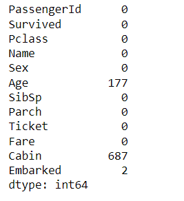
The above code shows you the null values in your dataframe. There are three columns showing null values, which are Age, Cabin, and Embarked.
How does the data look mathematically ?
df.describe()
The above code shows how does the data look mathematically. It tells us about count, mean, min, max, etc. of each columns or variables in the dataset.
Are there duplicate values in data (rows)?
df.duplicated().sum()The above code shows number of duplicate records in the dataset. Luckily we do not have any duplicates in our dataset.
How is the correlation between columns ?
df.corr(numeric_only=True)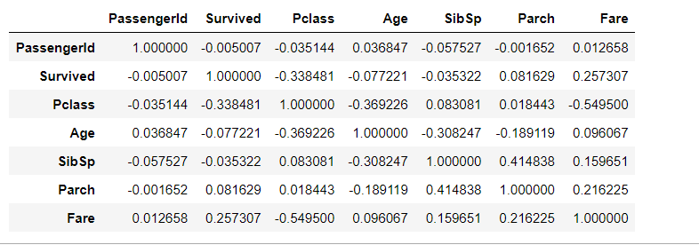
The above code tells us about relationship between any two variables (columns) ranges from -1 to 1.
- 1 indicates a perfect positive correlation: as one variable increases, the other variable also increases linearly.
- -1 indicates a perfect negative correlation: as one variable increases, the other variable decreases linearly.
- 0 indicates no linear correlation between the variables.
EDA (Exploratory Data Analysis):
EDA stands for Exploratory Data Analysis. In machine learning, EDA refers to the process of analyzing and visualizing data to understand its structure, patterns, and relationships before building a predictive model. It involves techniques such as summary statistics, data visualization, and correlation analysis to gain insights into the data’s characteristics, identify outliers, missing values, and potential challenges for modeling.
There are mainly two types of EDA. Univariate analysis, and Bivariate or Multivariate analysis.
Univariate Analysis:
Univariate analysis means, analyzing a single column or variable in dataframe. Lets see Univariate Analysis for categorical data (Survived, Pclass, Sex):
Draw a count plot here to get the frequency of each categories in ‘Survived‘ column using seaborn.
df['Survived'].value_counts().plot(kind = 'bar')

# OR Try below code

sns.countplot(x=df['Survived'], dodge=False)

Draw a count plot here to get the frequency of each categories in ‘Pclass‘ column using pie chart.
df['Pclass'].value_counts().plot(kind = 'pie', autopct='%.2f')
Draw a count plot here to get the frequency of each categories in ‘sex‘ column using bar chart.
df['Sex'].value_counts().plot(kind='bar')Univariate Analysis for numerical data:
Display the frequency or count of data points falling within specified intervals or bins.
plt.hist(df['Age'])We can draw boxplot for same ‘Age’ column. It includes the minimum, maximum, median, and quartiles, as well as any potential outliers in the data.
sns.boxplot(df['Age'])Also try below code on ‘Age’ column as well to see distribution of Age data.
df['Age'].min()

df['Age'].max()

df['Age'].mean()

df['Age'].skew()
The skewness indicates whether the data is skewed to the left (negative skewness), or to the right (positive skewness), or symmetrically distributed around the mean (skewness close to zero).
Bivariate and Multivariate Analysis:
#  Scatterplot (Numerical -to- Numerical)

sns.scatterplot(x=df['Age'], y=df['Fare'])
You can extent it to multivariate by passing more parameters of variable like below.
sns.scatterplot(x=df['Age'], y=df['Fare'], hue=df['Sex'], style=df['Survived'], size=df['Pclass'])
Bar Plot (Numerical – Categorical)
sns.barplot(x=df['Pclass'], y=df['Age'], hue=df['Sex'])Box Plot (Numerical – Categorical)
This graph between male and female where you will find some outliers as well.
# It shows minimum, first quartile (Q1), median (Q2), third quartile (Q3), and maximum.

sns.boxplot(x=df['Sex'], y=df['Age'])
#Histplot
sns.histplot(df[df['Survived']==0]['Age'], kde=True)
sns.histplot(df[df['Survived']==1]['Age'], kde=True)In above graph we can see that they tried to save young kids, that’s why survival probability of young kids are little more compare to older ones.
Let’s say if we wanna find out in each Pclass how many people survived and how many did not.
HeatMap (Categorical – Categorical)

sns.heatmap(pd.crosstab(df['Pclass'],df['Survived']))
The below code is calculation percentage of survival of each class.
(df.groupby(['Embarked']).mean()['Survived']*100)Feature Engineering:
1- Feature Transformation:
- Missing Value Imputation
In missing value imputation, the missing values are replaced with estimated values based on the available data. This can be done using various statistical techniques such as mean, median, mode imputation for numerical data, or using predictive models to estimate missing values based on other features in the dataset.
Drop all null values from dataset using below code.
df = df.dropna()Impute missing values with mean
df = df.fillna(df.mean())We can also impute missing values with median. This method is useful when the variable has outliers or a skewed distribution that might affect the mean imputation.
df['Age'] = df['Age'].fillna(df['Age'].median())Impute missing values with mode. The most frequently occurring value, of the respective variable. This method is suitable for categorical or discrete variables.
df['Embarked'] = df['Embarked'] .fillna(df['Embarked'] .mode().iloc[0])Remove the unnecessary Cabin column as well.
df = df.drop(columns=['Cabin'])- Handling Categorical Features
Handling categorical features refers to the process of dealing with variables that represent categories or labels rather than numerical values. Machine learning algorithms typically require numerical input, so categorical features need to be transformed or encoded before being used in models. We have three main encoding techniques such as One-hot encoding, Ordinal encoding, and Label encoding. We can do one of the below two things for handling categorical features. Lets try second method on our embarked column data.
#Label encoding

from sklearn.preprocessing import LabelEncoder
label_encoder = LabelEncoder()
df = label_encoder.fit_transform(df['Embarked'])
Second method
#Converting the categorical features 'Sex' and 'Embarked' into numerical values 0 & 1

df.Sex=df.Sex.map({'female':0, 'male':1})
df.Embarked=df.Embarked.map({'S':0, 'C':1, 'Q':2,'nan':'NaN'})
df.head()
- Outlier Detection
Outlier detection is the process of identifying data points in a dataset that significantly deviate from the rest of the data. These data points, known as outliers, may represent errors in data collection, measurement variability, or rare events. The most popular outlier detection and removal techniques are Z-score, IQR, Percentile approach, MAD, etc. Here in this titanic project dataset we are gonna try percentile approach.
There are some outliers in ‘Age‘ column. Lets define upper and lower threshold for our ‘Age‘ column.
upper_limit = df['Age'].quantile(0.95)
upper_limit
lower_limit = df['Age'].quantile(0.05)
lower_limit# now see the outlier data for 'Age' column looks like below:
df[(df['Age'] >= upper_limit) | (df['Age'] <= lower_limit)]# So, our new dataframe after outlier removal will be:
df = df[(df['Age'] <= upper_limit) & (df['Age'] >= lower_limit)]
df.shape- Feature Scaling
Feature scaling is the process of transforming the values of numerical features in a dataset to a similar scale or range. This is important because machine learning algorithms may perform poorly when features have different scales. We have mainly two methods for feature scaling standardization, and normalization.
We need to scale our independent(input) variables using standardization.
new_df = df[['Age', 'Fare']]

# Lets use Standerdization on 'Age' & 'Fare' columns,

from sklearn.preprocessing import StandardScaler

scaler = StandardScaler()

# fit the scaler to the dataframe.
scaler.fit(new_df)

# transform dataframe
df1 = scaler.transform(new_df)

df_scaled = pd.DataFrame(df1, columns=new_df.columns)
Now concatenate the new dataframe df_scaled with original dataframe df and store it back to the df only.
# Concatenate along columns
df = pd.concat([df, df_scaled], axis=1)
df
2- Feature Construction:
Applying Feature Construction first, means combine two or more columns into one. Applying it on ‘SibSp‘ and ‘Parch‘ columns.
df['Family_size'] = df['SibSp'] + df['Parch'] + 1Write the below function to assign values and call the fuction.
def myfunc(num):
    if num == 1:
        # alon
        return 0
    elif num > 1 and num <=4:
        # small family
        return 1
    else:
        # large family
        return 2
df['Family_type'] = df['Family_size'].apply(myfunc)Now lets drop these three columns ‘SibSp‘, ‘Parch‘, ‘Family_size‘.
df.drop(columns=['SibSp', 'Parch', 'Family_size'], inplace=True)Feature Splitting:
Lets split the Name feature (column) for extra analysis.
df['Title'] = df['Name'].str.split(', ', expand=True)[1].str.split('.', expand=True)[0]

df[['Title', 'Name']]

# now run some analysis on these splitted columns like below:

(df.groupby('Title').mean()['Survived']).sort_values(ascending=False)
By doing above analysis, we can say that there are high survival rate in titles like (Mrs, Miss, Major)
#Cleaning the data by removing irrelevant columns

df=df.drop(['Name','Ticket','PassengerId'], axis=1)
# Drop the first occurrence of the duplicate column 'Age', 'Fare'
df = df.loc[:, ~df.columns.duplicated(keep='last')]3- Dimensionality Reduction:
Feature Selection is a technique that can be perform after model building as well. Because, by selecting particular feature we can decide whether it affects the model performance or not. Here we are skipping these steps now. You can do this if you want in future.
Creating Model (Modeling)
Let’s create the model using Logistic Regression algorithm. We can use any algorithm we want.
#Cleaning the data by removing 'Title' column. We created it only for indivisual analysis.

df=df.drop(['Title'], axis=1)
Lets use train-test-split.
# Splitting the data for training and testing using train-test-split

from sklearn.model_selection import train_test_split

X_train, X_test, y_train, y_test = train_test_split(
    df.drop(['Survived'], axis=1),
    df.Survived,
    test_size= 0.2,
    random_state=0,
    stratify=df.Survived)
Use Logistic Regression now and predict data using accuracy score.
from sklearn.linear_model import LogisticRegression

lrmod = LogisticRegression()
lrmod.fit(X_train, y_train)

from sklearn.metrics import accuracy_score

y_predict = lrmod.predict(X_test)
accuracy_score(y_test, y_predict)
Draw confusion matrix as well.
#Confusion Matrix

from sklearn.metrics import confusion_matrix

cma=confusion_matrix(y_test, y_predict)
sns.heatmap(cma,annot=True)
Processing test data:
Now lets process the test data as well. We need to do all the above things again on test data. First import test data file.
test = pd.read_csv('test.csv')We can apply predict function on test data and store result in new submission file.
prediction = lrmod.predict(test)
prediction
submission = pd.DataFrame({"Survived": prediction})
submission.to_csv('submission.csv', index=False)
prediction_df = pd.read_csv('submission.csv')
#Visualizing predicted values
sns.countplot(x='Survived', data=prediction_df)
At the end we could use pickling method as well. So this is how we created our model using Logistic Regression and predicted the survival chances for new test data as well.
I do not even know how I ended up here but I thought this post was great I dont know who you are but definitely youre going to a famous blogger if you arent already Cheers.
Such a nice explanation! I’m a screen reader user however, it is very easy to understand. Kindly make more projects regarding AI-ML and Data Visualization and explain each and every thing in videos as well, because I’m a VI programmer. Again Thank You.