Analyzing retail sales in Power BI involves creating a data model, designing visualizations, and extracting meaningful insights. Here’s a step-by-step guide to perform retail sales analysis in Power BI real time project.
Overview
In this article I will show you the end-to-end Power BI project that any beginner can relate to or learn more basic things from it. I have covered almost all basic steps involved in any Power BI analysis project. The data we will see in this project is not the actual data or some of it might be hidden due to security reasons, but I tried to mimic it with the actual project so enjoy. Download dataset from here.
Steps for any Power BI Project Flow
- Business requirement document (BRD)
- Functional requirement document (FRD) – This is optional
- Data Gathering (Database, CSV, Excel..)
- Data Cleaning / Data transformation / Pre-processing
- Data Modeling
- Mockup Preparation
- UI Chart (Report Building)
- DAX Functions (DAX Calculations)
- Enhance UI
- RLS
- Create workspace and provide the workspace access within team.
- Publish the report to the workspace
- Dashboard/Mobile view (optional) – Create as an App
- Gateway (one time step)
- Schedule a refresh
- Add roles to security
- Subscribe, Manage alerts
- Share the report
- BRD:- A Business Requirement Document (BRD) is a formal document that outlines the business objectives, functional requirements, and specifications for a project or initiative.
- FRD:- A Functional Requirements Document (FRD) is a detailed document that outlines the specific functionalities, features, and capabilities required for a system, software application, or product.
- Data Gathering:- This step is usually done by your SQL developer or Data Engineer. Either you can ask them for data or you can do this step by yourself.
- Data Cleaning:- Before jumping on modeling and creating reports check if your data is clean enough.
- Data Modeling:- Create relationships between data tables for better filtering results and more meaningful reports.
- Mockup:- You can create the layout of visuals using pen and paper or on any mockup tool to create wireframe like structure to get early feedback from customers or stakeholders.
- RLS:- Row-Level Security, is a feature in Power BI that allows you to restrict data access at the row level based on user roles and rules defined in the data model.
- Gateway:- A gateway is a tool that acts as a bridge between on-premises data sources and the Power BI service in the cloud. It allows Power BI to refresh and access data from on-premises data sources securely.
Data Collection or Requirement Gathering in Power BI
Data collection and requirement gathering are crucial steps in the process of building and implementing any system, application, or project. They involve gathering, documenting, and analyzing the information needed to understand the goals, constraints, and specifications of the project.
In this step we will mainly focus on BRD, FRD, and Datasets from various sources which will be shared to you by clients. Some of the clients provides only BRD document, and some are provides both BRD and FRD. In BRD it will have actual business use case and what needs to be done in this project. In FRD document, there might be some functionality involved like what needs to be done and each specific tasks that we need to perform.
Below I am showing you an sample BRD document: Access full document here.
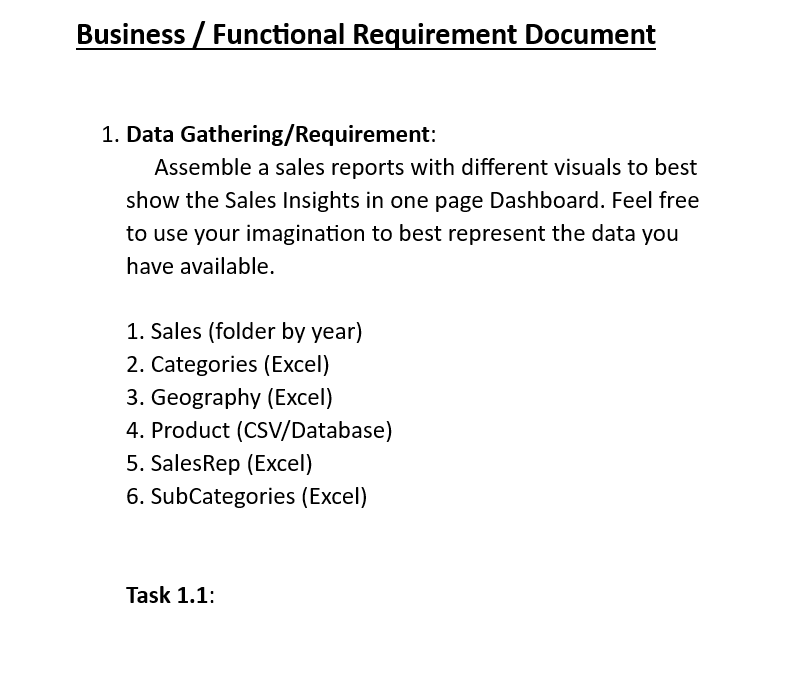
Let’s say for our project we got the data from different sources like Excel, CSV, and MySQL Database. So we will extract the data first. If client provides you the data then fine, otherwise it’s your responsibility to gather the data from different sources. Each and every point mentioned in the BRD document we need to implement. According to the BRD document, they are telling us from where to get data and load it one by one.
Let’s bring first Category table mentioned in BRD document. It’s an Excel file, and this is our Dimension table as well.
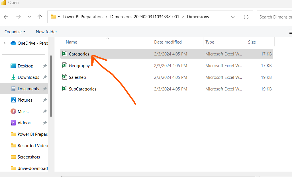
Similarly load the Geography, SalesRep and SubCategories tables as well. Now as per BRD document there is Product data given which can be brought from CSV file or from Database. in our case we will use MySQL Database for product tables data.
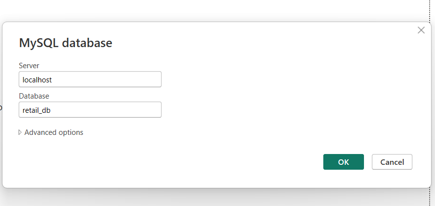
Just go to the MySQL database table Product where all your product related data is stored.
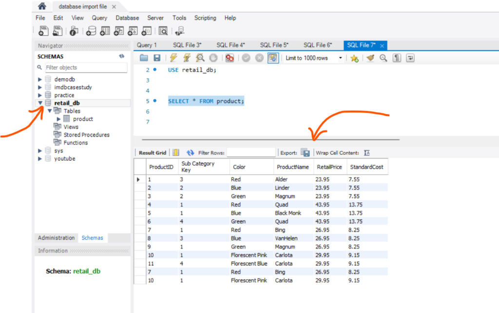
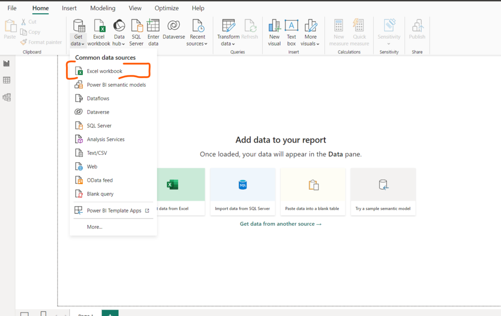
Go to the Power BI Desktop and in ‘Get data‘ option select MySQL Database. It will ask you for two things, first is Server name and second is Database name from where you want to get the data. Both of these things you will find easily in MySQL Workbench. in our case Server name is localhost/ID. Remember after doing all these, we must establish connection between Power BI Desktop and MySQL Workbench instance for which we need Username and Password of the MySQL instance (username usually is root).
So now we have gathered our Dimension data from different sources. Now let’s get our Sales data as well.
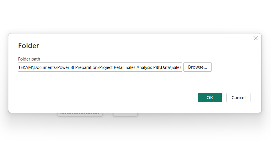
So for getting Sales data we will apply automation and combine all Sales files into one large file so that if there is any new data file comes into the folder of Sales, we don’t have to do import again. It will automatically get added to the dataset.
Go to the ‘Get data‘ option and select ‘Folder‘ and paste the entire path of respective folder.
Right now we have all the data that we need to complete the given tasks. We have total six tables, out of which ‘Sales‘ table will be the Fact table and rest all will be the Dimension tables.
Data Transformation and Cleaning in Power BI
After collecting and importing all the necessary data, we need to check if all the data is correct or not. So we are gonna do some transformation using Power Query Editor.
Understand Your Data:
- If you see Categories table, here CategoryKey and Category name columns are given which seems to be correct. So we don’t have to make any changes here.
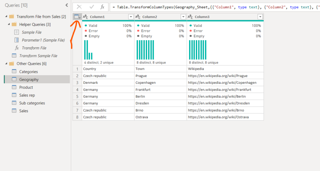
- In Geography table columns names are miss placed at first row of the table. So we need to correct it.
- In Product table we have product related information. Here in ProductID column, you can spot some duplicate records. Remember one thing that Dimension table cannot have duplicates. So we have to correct this one as well.
- SubCategory table and SalesRep table are dimension tables. In SalesRep table we need some correction.
In Power Query Editor Go to the Geography table data and apply the ‘Use first row as header‘ option.
Do the same thing on SalesRep table and apply the ‘Use first row as header‘ option.
If you see Sales table column SalesRepID, which have only 1,2,3… like wise IDs, but in SalesRep table there is some ‘ID – 1’ value is given. We need to correct all of them.
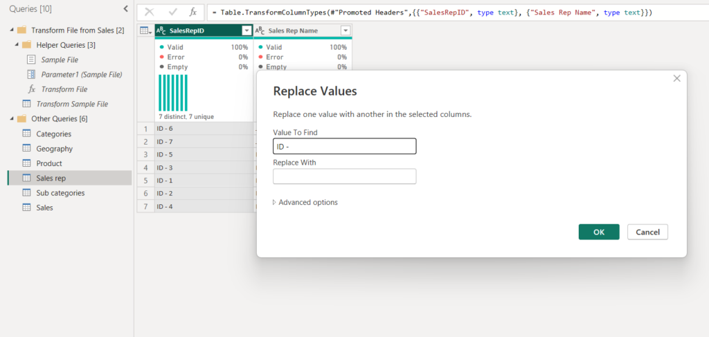
As you can see above, go to SalesRep table and select SalesRepID column then right click and select ‘Replace‘ option. Now replace ‘ID -‘ with blank value. Similar thing we have to do in SubCategory table as well with CategoryKey column.
In Sales table we can remove some unnecessary columns like, ‘Source.Name‘. Also we need to split the Location column into two different columns, one for country and other for town using semicolon delimiter.
In Product table ‘ProductID‘ column has some duplicate records as we know that dimension table cannot have duplicate. Apply remove duplicate option on this.
Seems like our data is pretty clean right now. So go ahead and check the tasks mentioned in BRD document and try to implement.
Data Computation in Power BI
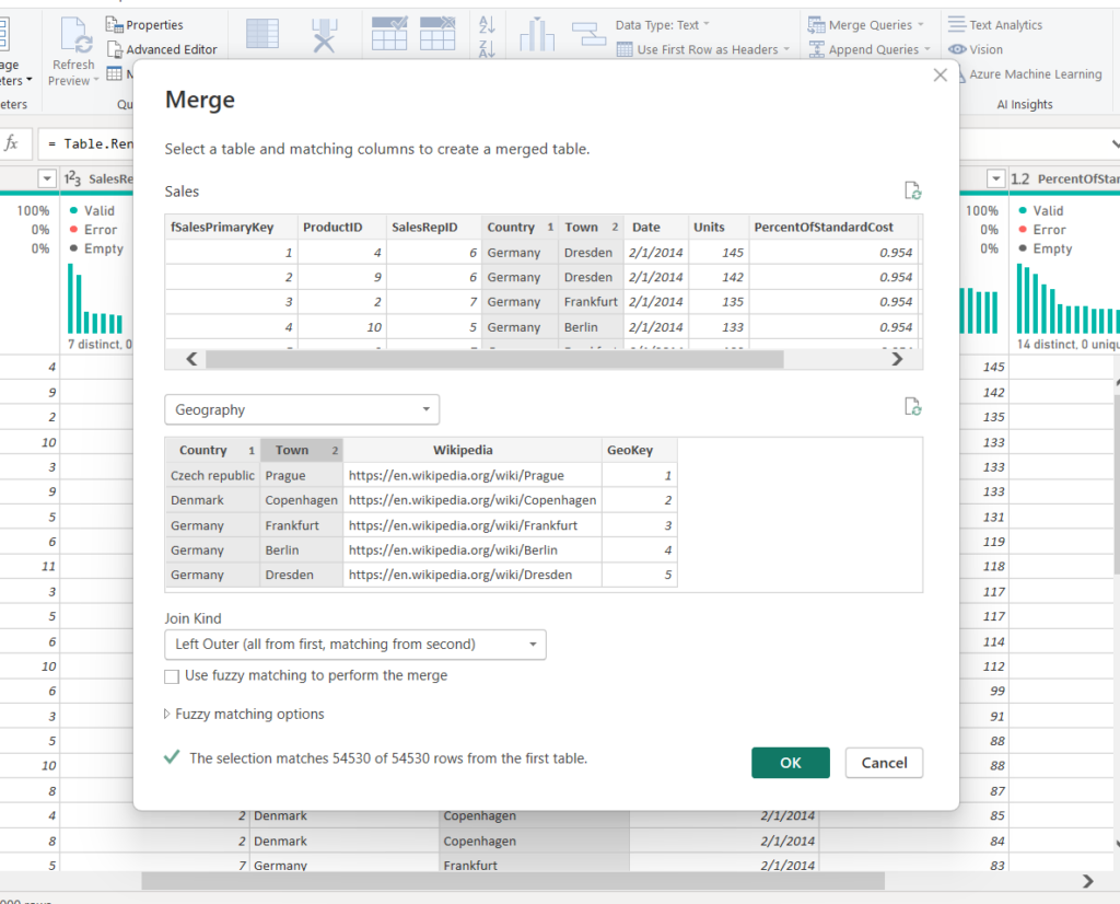
As per (Task 2.2) in BRD client asking us to create unique key (GeoKey) in Sales and Geography table. We will add index column in Geography table and merge it with Sales table for Country and Town columns. So by doing this the categorical data in Sales table we can remove and just make use of index values. After all this changes just click Close and Apply button.
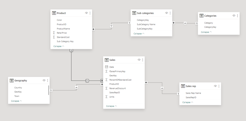
For data modeling part we need to connect the remaining tables with each other based on common column keys and IDs and establish the relationships. See the below image.
Remember the thumb rule which is whenever there is a date column in any of the tables in your model, make sure you create a separate master date table for it. It’s not mandatory but, it is a good practice to create separate date table. It is very helpful when you create time intelligence function.
Create a new table here using DAX query. Name this table as DateMaster table.
DateMaster = CALENDAR(FIRSTDATE(Sales[Date]), LASTDATE(Sales[Date]))If you commit the above query, you will get a new table. now in this table we can perform time intelligence functions and find out sales by year, sales by quarter, sales by month, sales by week, and many more things.
In this same DateMaster table add a new column and name it as ‘Year’.
Year = Year(DateMaster[Date])Similarly create another column for month.
Month = month(DateMaster[Date])Month Name = FORMAT(DateMaster[Date], "MMMM")Similarly create another column for quarter.
Qtr = QUARTER(DateMaster[Date])Similarly create another column for week number and week day.
Week Num = WEEKNUM(DateMaster[Date])Week Day = WEEKDAY(DateMaster[Date])Week Day Name = FORMAT(DateMaster[Date], "DDDD")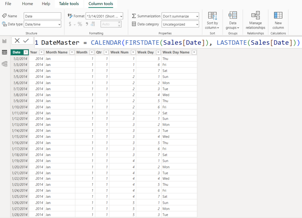
DAX Calculations in Power BI
There are some DAX calculations that client want us to do. According to the Task 3.1 in BRD document, we need Total Revenue column in same Sales table.
Total Revenue = Sales[Units] * RELATED(Product[RetailPrice])As per Task 3.2 calculate Total Cost in same Sales table.
Total Cost = Sales[Units] * RELATED(Product[StandardCost])As per Task 3.3 calculate Gross Profit in same Sales table.
Gross Profit = Sales[Total Revenue] - Sales[Total Cost]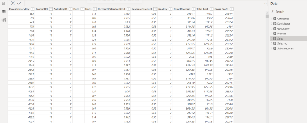
Now there are some tasks which require to create Measures as well. Begore that go to the Model View tab in Power BI Desktop and connect the new DateMaster table with Sales table using one to many relationship.
Create Power BI UI Reports
Building a Power BI report involves creating visualizations that help analyze and interpret data. Power BI is a powerful tool that allows users to connect to various data sources, transform data, and create interactive reports. Here is a step-by-step guide to building a Power BI report:
We have all the necessary data we need. Now let’s start building the report.
Go to the report view of Power BI Desktop and start with title first. In the Home tab there is ‘Text Box‘ option, select it and write your desired title. Make it center of the canvas and change the background color.
Just increase the page size if needed, so that you can fit more visuals in it.
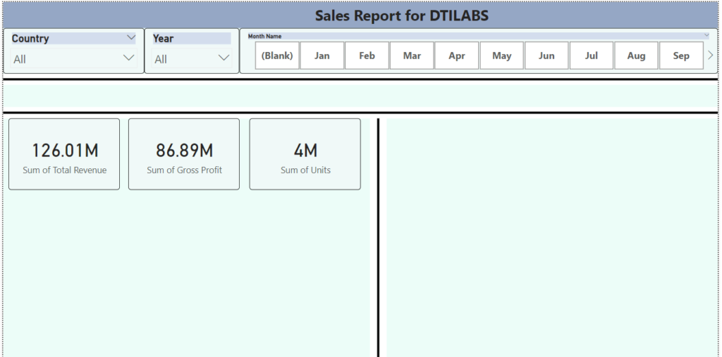
Next add some Country, Year and Month slicers to easily filter the visuals.
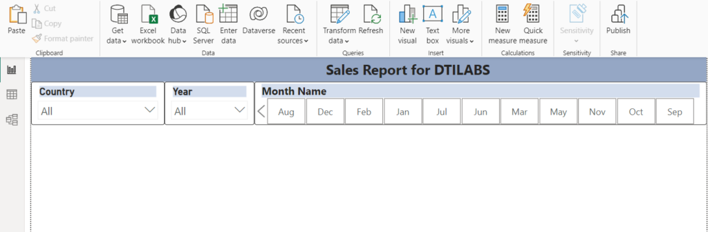
As you can see above, the month name slicer is not in order. So to make it in order like Jan, Feb, Mar and so on create a new column in the same DateMaster table and name it as ‘Month Order’.
Month Order = DateMaster[Date].[MonthNo]Now you can just sort the Month Name column by Month Order in either ascending or descending order.
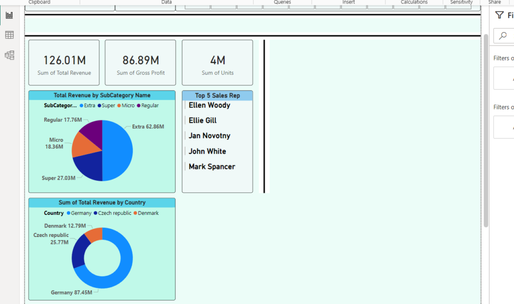
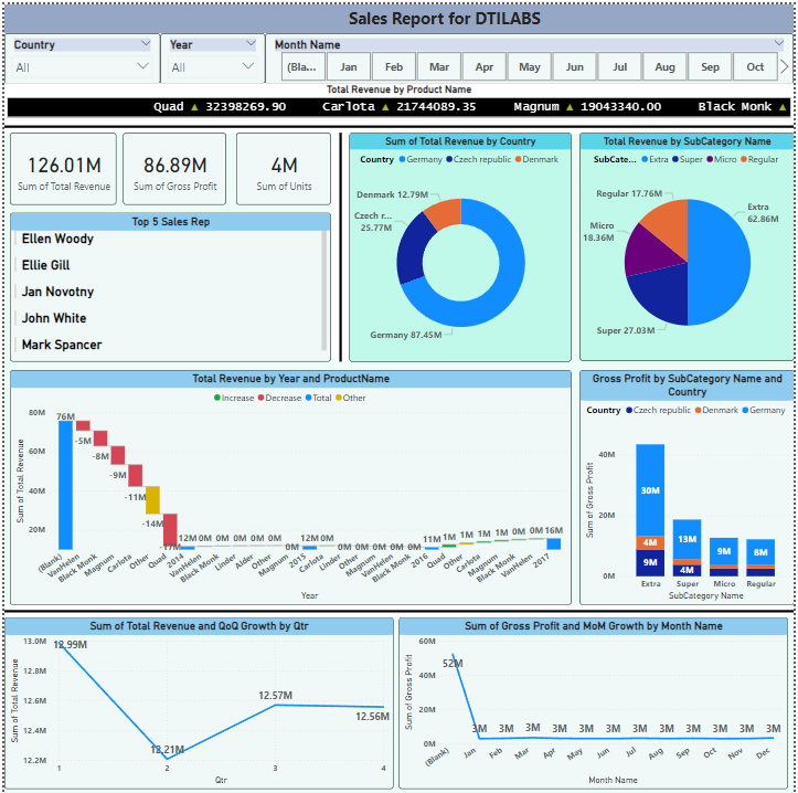
Next create few cards like Total Revenue, Gross Profit, Units. Also change the background color of the page if you want.
Now take some Pie Chart or Donut Chart and show Total Revenue by SubCategory and Category or Country. Then take a multi row card and show order of top five sales persons (representatives) who made most gross profit.
In BRD document, the Task 3.7 they are asking us to Breakdown Analysis by Product (drop or increase). We can also arrange the visuals as we want. Furthermore client wants to show QoQ and MoM growth. You can implement these extra visuals on second page as well.
Create new measures for Quarter on Quarter (QoQ) sales.
Tot Rev = SUM(Sales[Total Revenue])Prev Qtr = CALCULATE([Tot Rev], PREVIOUSQUARTER(DateMaster[Date]))QoQ Growth = ([Tot Rev] - [Prev Qtr]) / [Prev Qtr]See the QoQ growth calculation in table below:
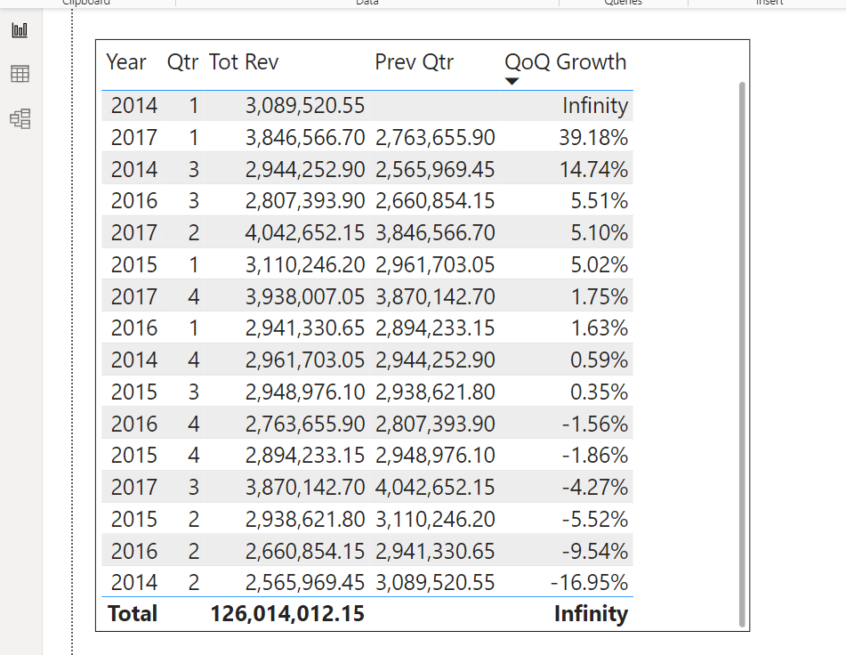
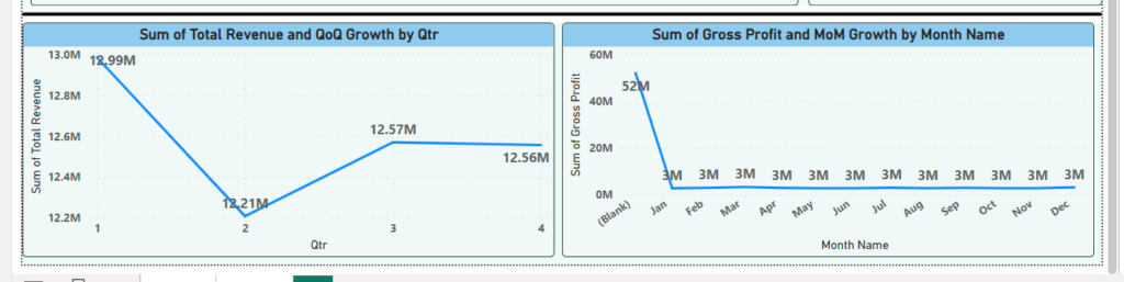
Now create the line visual in our original page and use these QoQ calculations to show data. Do the similar thing for Month on Month growth (MoM) for gross profit.
Tot Profit = SUM(Sales[Gross Profit])Prev Month Profit = CALCULATE([Tot Profit], PREVIOUSMONTH(DateMaster[Date]))MoM Growth = ([Tot Profit] - [Prev Month Profit]) / [Prev Month Profit]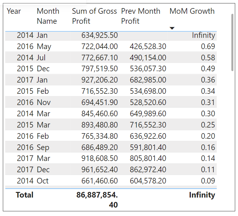
Use these above two calculation tables to create below line chart visuals.
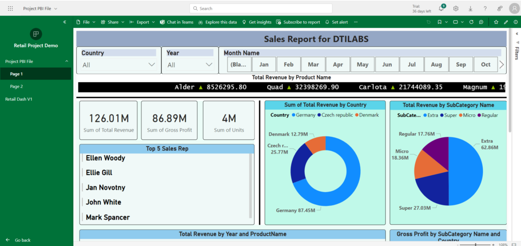
If there is any tasks remain from the the BRD document, please make sure to complete those. Try to optimize each and every space on the page to create the visuals. So before publishing the report it should look something like this:
Publishing and Dashboard Creation
Publishing and dashboard creation are essential steps in the Power BI workflow that enable users to share their reports and visualizations with others.
RLS :
Row-Level Security (RLS) in Power BI is a security feature that allows you to restrict data access at the row level based on user roles and rules defined in the data model. RLS ensures that users can only see the data that is relevant to them, based on their role, thereby enhancing data security and privacy.
It can be region specific as well, means let’s say users in Mumbai should not be able to see reports of New York and vice versa. This RLS has to be implemented in Power BI Desktop first, then only we can publish it in Power BI Service. Now there are two types of RLS, Static and Dynamic. Usually most preferred one is dynamic RLS.
In our report, let’s say we want to implement RLS on Country column. Means only specific country users can see their regional data and not the other countries data. Go to the Manage Roles option in Modeling tab, and create the roles for different countries using filter.
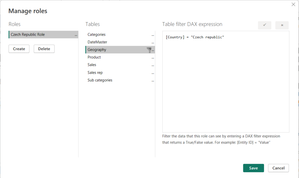
You can see the roles on View as option right beside the Manage roles option. We will see more of this in later part of the article.
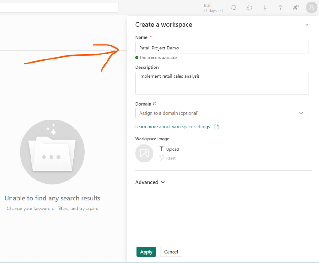
Create a Workspace in Power BI Service:
In Power BI, a workspace is a container for Power BI content, including reports, dashboards, datasets, and dataflows. Workspaces provide a way to organize and collaborate on Power BI content within the Power BI service. They allow users to group related items together, share content with specific users or groups, and manage access and permissions. This is a mandatory step in order to collaborate with your team.
Let’s log in into Power bi service, and create a new workspace and name it as ‘Retail Project Demo‘.
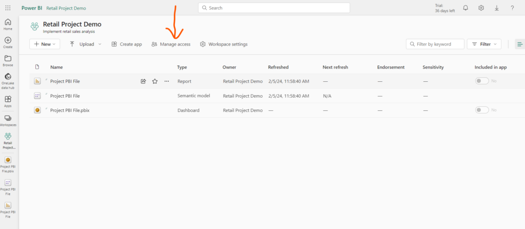
Now you can publish your report from Power BI Desktop to the Service in cloud.
You can manage access to this report as you are the default Admin. There are different access roles like Admin, Member, Contributor and Viewer but viewer does not have edit access it can only view the report.
As we saw earlier in RLS we have to create role filters for individual roles, what if there are multiple countries or cities, in this case this static RLS does not make sense. Instead, make use of dynamic RLS. So when the person log-in, we can give that person access accordingly by creating a new access table.
Import this new Access table into the Model and connect it with Geography table based on country column. Make a new measure for system login detail:
whoami = USERPRINCIPALNAME()Now go to the manage roles option and do the same thing we did earlier, create a new role for users and use userprincipalname() DAX function in it and then publish it again. Remember one thing that your RLS will work for viewer access only.
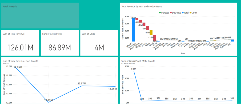
Building a Dashboard:
Dashboard is a single page UI, so we have to pin important and necessary visuals from the report to the dashboard. Create a new dashboard and start selecting visuals for pin. Dashboard will arrange all the visuals in tiles format. If we click on any of the visuals from dashboard it will redirect you to the original report where you can see detailed information.
Go ahead and change the dashboard theme and layout if you want. Dashboard is not interactive like report is. Below is the sample of dashboard you can see:
Gateway:
In Power BI, a gateway is a tool that facilitates secure communication between Power BI services in the cloud and on-premises data sources. The Power BI Gateway allows you to refresh data, schedule automatic data refreshes, and ensure that your Power BI reports and dashboards reflect the most up-to-date information from your on-premises data sources.
Go ahead and download the ‘Data Gateway’. You can choose from standard mode or personal mode. Once it is downloaded, just install it on premise and connect it with your cloud service. You can access it under Semantic Model file in Power BI Service. You will find Gateway and Cloud Connection option in it.
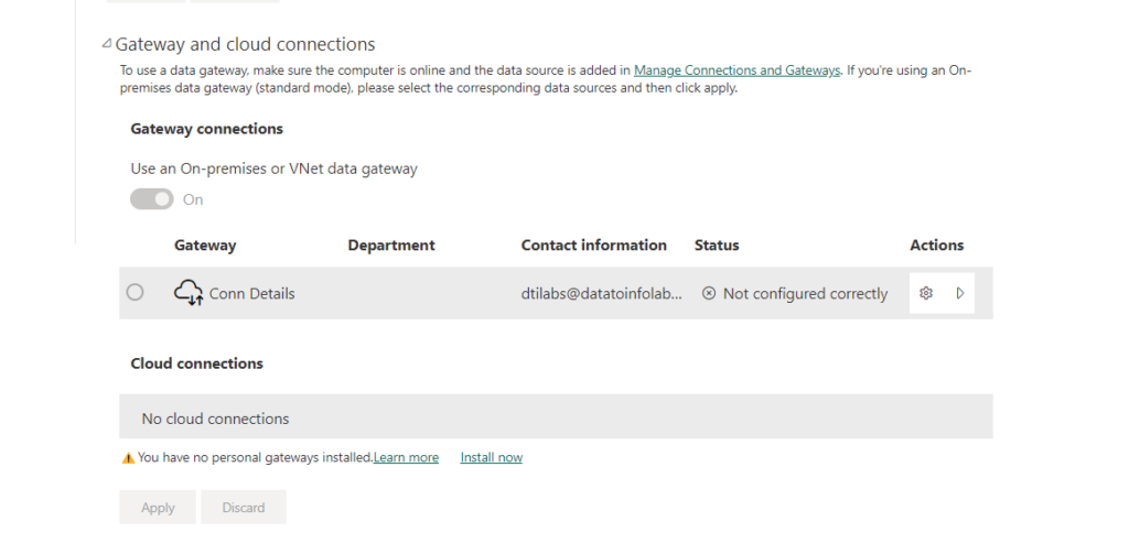
After this step configure the refresh schedule as well.
Subscription and Alerts:
In Power BI Service, you can use subscriptions and alerts to stay informed about changes and updates in your reports and dashboards. Subscriptions allow you to receive email notifications when certain conditions are met, while alerts notify you immediately when specific data thresholds are reached.
How to Create a Subscription:
- Open the report or dashboard in Power BI Service.
- Click on the “Subscribe” button located in the toolbar.
- Configure the subscription settings, including the frequency of notifications (e.g., daily, weekly) and the time.
- When the subscription conditions are met, you’ll receive an email with a link to the report or dashboard.
How to Create an Alert:
- Open the report in Power BI Service.
- Select a visual element (e.g., chart, table) for which you want to create an alert.
- Right-click on the visual element and choose “Analyze” > “Create alert.“
- When the alert conditions are met, you receive an email notification immediately.
Create App in Workspace:
It’s like a final product you will be creating in workspace. In Power BI, an app refers to a collection of dashboards, reports, and datasets bundled together to deliver a specific business solution or set of insights. Power BI apps are used to package and distribute analytics content in a standardized and user-friendly manner, allowing users to consume pre-built dashboards and reports without having to individually create or assemble them. This is what the app looks like:
This is what I had to offer you. I hope you must like my efforts to show all basic steps to create a report and dashboard. Happy learning!