These techniques allow you to identify relationships, dependencies, and interactions between variables in your dataset. We have already seen univariate analysis in previous article. Here we will explore more on bivariate and multivariate analysis using different plots and draw relations between them.
Hello Everyone, we are on the journey to do EDA, and by plotting various graphs we can perform some analysis. we will see all those one by one.
Download dataset CSV files here.
What is EDA in Machine Learning
It stands for Exploratory Data Analysis. It is an important initial step that we do in data analysis that involves examining and understanding the dataset to gain insights, identify patterns. EDA helps in uncovering the underlying structure of the data and informing modeling decisions.
Before going further we should know types of data we deal with. There are usually two types of data we work with numerical and categorical.
Numerical e.g. : Age, weight, number of students, count of passengers, etc.
Categorical e.g. : Gender, Colors, Grades, country, etc.
For demonstrating my points I will take help of different datasets here like, titanic, flight, iris, tips.
What is Bivariate Analysis
Bivariate analysis includes plotting scatter plot for visualize the relationship between two numerical variables, correlation analysis to calculate linear relationship between two numerical variables, and sometimes box plot as well.
What is Multivariate Analysis
Multivariate analysis includes Heatmaps and Pair Plots to visualize the correlations between multiple numerical variables. Dimensionality reduction of the dataset helps visualize the relationships between variables in a lower-dimensional space which helps in identifying clusters or patterns within the data.
Import all necessary libraries and read datasets.
import pandas as pd
import seaborn as sns
This tips dataset loaded from seaborn.
tips = sns.load_dataset('tips')Preview of tips
tips.sample(5) total_bill tip sex smoker day time size
194 16.58 4.00 Male Yes Thur Lunch 2
171 15.81 3.16 Male Yes Sat Dinner 2
181 23.33 5.65 Male Yes Sun Dinner 2
238 35.83 4.67 Female No Sat Dinner 3
9 14.78 3.23 Male No Sun Dinner 2Read titanic, flight, and iris dataset as well and preview it.
titanic = pd.read_csv('train.csv')
flights = sns.load_dataset('flights')flights.head()iris = sns.load_dataset('iris')
iris1. Scatterplot (Numerical – Numerical)
For tips data This is a good example of multivariate analysis, as here we are going to find some linear relationship between two variables. On scatter plot we usually keep categorical variables on x axis and numerical on y axis. For this particular example, we are having both numerical columns x and y.
sns.scatterplot(x=tips['total_bill'], y=tips['tip'])You can extent it to multivariate by passing more parameters of variable like below.
sns.scatterplot(x=tips['total_bill'], y=tips['tip'], hue=tips['sex'], style=tips['smoker'], size=tips['size'])
2. Bar Plot (Numerical – Categorical)
Let’s use titanic dataset for this bar plot and draw relation.
sns.barplot(x=titanic['Pclass'], y=titanic['Age'], hue=titanic['Sex'])
3. Box Plot (Numerical – Categorical)
Here we are plotting a graph between male and female where you will find some outliers as well.
sns.boxplot(x=titanic['Sex'], y=titanic['Age'])Extend it to,
sns.boxplot(x=titanic['Sex'], y=titanic['Age'],hue=titanic['Survived'])
Here you can see male with young age survived more, and in case of female with older age survived more.
4. histplot (Numerical – Categorical)
sns.histplot(titanic[titanic['Survived']==0]['Age'], kde=True)
sns.histplot(titanic[titanic['Survived']==1]['Age'], kde=True)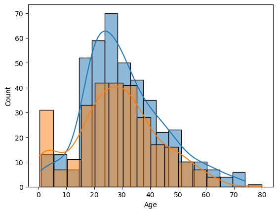
As you can see in above graph that they tried to save young kids, that’s why survival probability of young kids are little more compare to older ones.
5. HeatMap (Categorical – Categorical)
Let’s say if we wanna find out in each Pclass how many people survived and how many did not.
sns.heatmap(pd.crosstab(titanic['Pclass'],titanic['Survived']))The below code is calculation percentage of survival of each class.
(titanic.groupby(['Embarked']).mean()['Survived']*100)6. ClusterMap (Categorical – Categorical)
sns.clustermap(pd.crosstab(titanic['Parch'],titanic['Survived']))7. Pairplot
sns.pairplot(iris,hue='species')It shows color encoded plots.
8. Lineplot (Numerical – Numerical)
may_flights = flights.query("month == 'May'")
sns.lineplot(data=may_flights, x="year", y="passengers")
Here it shows every year in month of May how many passengers took flight.
Full code is here.
Conclusion
These are the basic tools you can use to do EDA process. I hope you must learn something. These analysis help in understanding the complexity and relationships within the data, which can guide feature selection, model building. Please check out the whole notebook for full code.