
Data visualization is a powerful tool for extracting insights, discovering patterns, and communicating findings effectively. Python offers a rich ecosystem of libraries that enable the creation of visually compelling and informative visualizations. In this article, we will explore the world of data visualization with Python, covering essential concepts, popular libraries, and practical examples.
What is Data Visualization and Importance
- Data visualization helps in understanding complex datasets by representing them visually.
- Visualizations aid in identifying trends, outliers, and relationships between variables.
- Effective visualizations enhance data communication, making it accessible to a wider audience.
Python Libraries for Data Visualization
- Matplotlib: A versatile library for creating a wide range of static, animated, and interactive visualizations.
- Seaborn: Built on top of Matplotlib, Seaborn provides a high-level interface for creating aesthetically pleasing statistical graphics.
- Plotly: Enables the creation of interactive visualizations, dashboards, and web applications.
- Pandas: Offers built-in visualization capabilities for exploring data directly from DataFrames.
- Bokeh: Focuses on interactive, browser-based visualizations that are suitable for web applications.
Basic Plot Types
- Line Plot: Displays the relationship between two continuous variables over a continuous interval.
- Scatter Plot: Visualizes the relationship between two variables using individual data points.
- Bar Plot: Compares categorical data using rectangular bars of varying heights.
- Histogram: Illustrates the distribution of a continuous variable by dividing it into bins and displaying the frequency of values within each bin.
- Box Plot: Represents the summary statistics of a dataset, including median, quartiles, and outliers.
Advanced Plot Types
- Heatmap: Depicts the magnitude of a variable using color intensity in a grid format.
- Violin Plot: Combines a box plot and a kernel density plot to display the distribution of data.
- Area Plot: Displays the cumulative contribution of different variables over time.
- Network Graph: Visualizes relationships between entities using nodes and edges.
- Geographic Plot: Shows data on maps to analyze spatial patterns and trends.
Matplotlib
Matplotlib is a widely used data visualization library in Python that provides a flexible and comprehensive toolkit for creating various types of plots. Whether you’re a beginner or an experienced data analyst, Matplotlib offers a vast range of functionalities to visually represent your data. In this article, we will explore the power of Matplotlib through examples of common plot types and customization options.
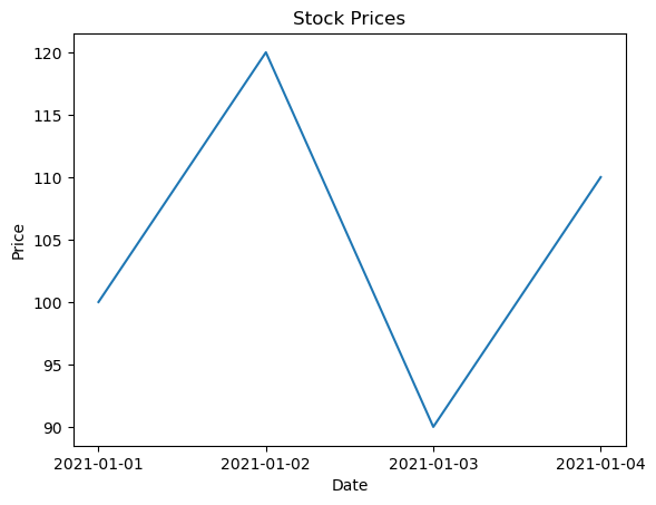
- Line Plot:
A line plot is a fundamental plot type used to display the relationship between two continuous variables. Let’s create a simple line plot to visualize the trend of stock prices over time:
import matplotlib.pyplot as plt

# Sample data
dates = ['2021-01-01', '2021-01-02', '2021-01-03', '2021-01-04']
prices = [100, 120, 90, 111]

# Create line plot
plt.plot(dates, prices)
plt.xlabel('Date')
plt.ylabel('Price')
plt.title('Stock Prices')
plt.show()
- Scatter Plot:
A scatter plot is useful for visualizing the relationship between two variables. Let’s generate a scatter plot to represent the correlation between the weight and height of individuals:
import matplotlib.pyplot as plt
import numpy as np

# Sample data
np.random.seed(1)
weight = np.random.normal(70, 10, 100)
height = np.random.normal(170, 15, 100)

# Create scatter plot
plt.scatter(weight, height)
plt.xlabel('Weight')
plt.ylabel('Height')
plt.title('Weight vs. Height')
plt.show()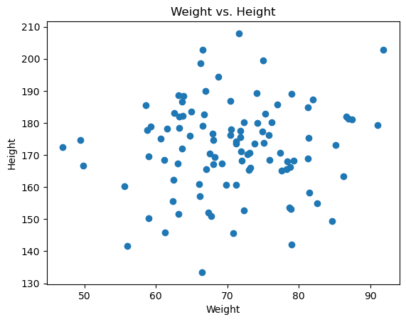
- Bar Plot:
Bar plots are effective for comparing categorical data. Let’s create a bar plot to visualize the sales performance of different products:
import matplotlib.pyplot as plt

# Sample data
products = ['Product A', 'Product B', 'Product C']
sales = [5000, 3000, 4000]

# Create bar plot
plt.bar(products, sales)
plt.xlabel('Product')
plt.ylabel('Sales')
plt.title('Product Sales')
plt.show()
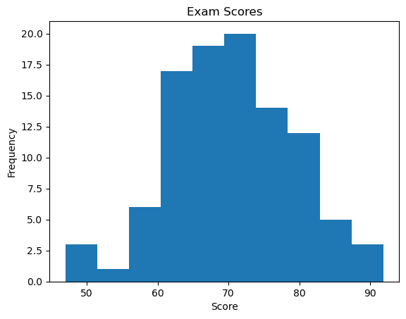
- Histogram:
Histograms display the distribution of a continuous variable by dividing it into bins and showing the frequency of values within each bin. Let’s plot a histogram to visualize the distribution of exam scores:
import matplotlib.pyplot as plt
import numpy as np

# Sample data
np.random.seed(1)
scores = np.random.normal(70, 10, 100)

# Create histogram
plt.hist(scores, bins=10)
plt.xlabel('Score')
plt.ylabel('Frequency')
plt.title('Exam Scores')
plt.show()
- Customization and Multiple Plots:
Matplotlib allows extensive customization options to enhance the visual appeal and convey specific information. Additionally, multiple plots can be combined to create complex visualizations.
Seaborn
Seaborn is a popular data visualization library built on top of Matplotlib. It provides a high-level interface for creating aesthetically pleasing statistical graphics. Seaborn offers a wide range of plot types and styling options to enhance data visualization. In this section, we will explore Seaborn with different examples to showcase its capabilities and demonstrate its usage in various scenarios.
Download All Database CSV Files HERE
- Scatter Plot:
import seaborn as sns

# Load sample dataset
tips = sns.load_dataset('tips')

# Create scatter plot with regression line
sns.scatterplot(x='total_bill', y='tip', data=tips)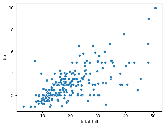
- Bar Plot:
Bar plots are effective for comparing categorical variables. Seaborn offers various options for creating bar plots with different levels of customization. For example:
import seaborn as sns

# Load sample dataset
titanic = sns.load_dataset('titanic')

# Create grouped bar plot
sns.barplot(x='class', y='survived', hue='sex', data=titanic)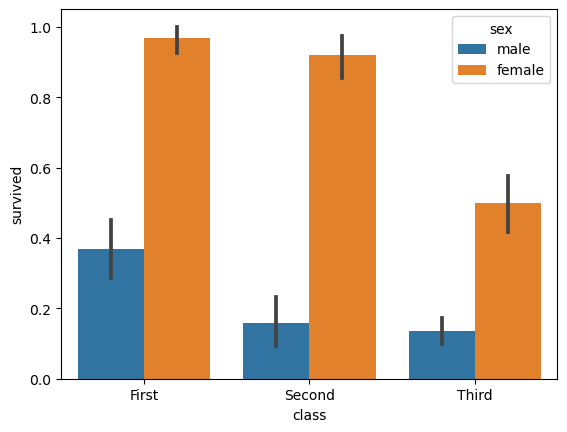
- Line Plot:
Line Plot in Seaborn plotted using the lineplot() method. In this, we can pass only the data argument also.
# importing packages
import seaborn as sns
import matplotlib.pyplot as plt
import pandas as pd


# reading the database
data = pd.read_csv("tips.csv")

sns.lineplot(x='day', y='tip', data=data)
plt.show()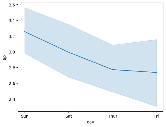
Plotly
Here are a few examples showcasing the versatility of Plotly, a popular Python library for creating interactive visualizations:
- Scatter Plot with Hover Information:
import plotly.graph_objects as go

# Create data
x = [1, 2, 3, 4, 5]
y = [2, 4, 1, 5, 3]
labels = ['Point 1', 'Point 2', 'Point 3', 'Point 4', 'Point 5']

# Create scatter plot with hover information
fig = go.Figure(data=go.Scatter(x=x, y=y, mode='markers', text=labels, hovertemplate='Label: %{text}'))

# Set plot layout
fig.update_layout(title='Scatter Plot with Hover Information', xaxis_title='X', yaxis_title='Y')

# Display the plot
fig.show()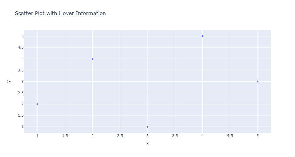
- Interactive Bar Chart:
import plotly.graph_objects as go

# Create data
categories = ['Category A', 'Category B', 'Category C']
values = [20, 35, 25]

# Create bar chart
fig = go.Figure(data=go.Bar(x=categories, y=values))

# Set plot layout
fig.update_layout(title='Interactive Bar Chart', xaxis_title='Category', yaxis_title='Value')

# Display the plot
fig.show()- 3D Surface Plot:
import plotly.graph_objects as go
import numpy as np

# Create data
x = np.linspace(-5, 5, 100)
y = np.linspace(-5, 5, 100)
X, Y = np.meshgrid(x, y)
Z = np.sin(np.sqrt(X**2 + Y**2))

# Create 3D surface plot
fig = go.Figure(data=go.Surface(x=X, y=Y, z=Z))

# Set plot layout
fig.update_layout(title='3D Surface Plot')

# Display the plot
fig.show()
Bokeh
The bokeh library provides a wide range of tools for creating interactive visualizations, including zooming, panning, tooltips, and more. With Bokeh, you can create dynamic and engaging visualizations to explore and present your data effectively.
- Scatter Plot with Hover Tool:
from bokeh.plotting import figure, show
from bokeh.models import HoverTool
from bokeh.sampledata.iris import flowers

p = figure(title="Iris Data - Sepal Length vs. Sepal Width", x_axis_label='Sepal Length', y_axis_label='Sepal Width')

p.circle(x=flowers['sepal_length'], y=flowers['sepal_width'], color='blue', size=8)

hover = HoverTool(tooltips=[("Species", "@species"), ("Sepal Length", "@sepal_length"), ("Sepal Width", "@sepal_width")])
p.add_tools(hover)

show(p)
This example creates a scatter plot using the Iris dataset and adds a hover tool that displays additional information about each data point when the mouse cursor is over it.
- Line Plot with Multiple Lines:
from bokeh.plotting import figure, show
from bokeh.palettes import Category10
import numpy as np

x = np.linspace(0, 2*np.pi, 100)
y1 = np.sin(x)
y2 = np.cos(x)

p = figure(title="Trigonometric Functions", x_axis_label='x', y_axis_label='y')

p.line(x, y1, legend_label='sin(x)', color=Category10[3][0])
p.line(x, y2, legend_label='cos(x)', color=Category10[3][1])

p.legend.location = 'top_left'
show(p)
In this example, a line plot is created to visualize the sine and cosine functions. Multiple lines are plotted on the same figure with different colors and legend labels.
Conclusion
Data visualization is a vital component of data analysis and storytelling. Python, with its diverse libraries, offers a powerful platform for creating compelling visualizations that facilitate understanding, discovery, and effective communication of data insights. By harnessing the capabilities of Python visualization libraries and adhering to best practices, data professionals can unlock the full potential of their data and deliver impactful visualizations that drive decision-making and enhance data-driven narratives.