Through this article you will get an understanding of how to create a advance Dashboard in Power BI for Call Center Data and also collect and analyzing call data to help businesses put their customers first.
Overview
In this Call Center Analysis project, we are going to design a advance Dashboard on Power BI. In this project client wants us to show information like, how many total calls are made, total calls by day or week, and many more. Also client wants us to show the sentiment analysis using visuals and other KPIs. We are planning to make two different dashboards here, one for Home and second for Grid. So without further ado let’s start working on it. Download dataset from here.
Flow of the Project
- Project Architecture
- Project BRD or FRD Documents
- Data Gathering (SQL Server Database)
- Data Cleaning / Data transformation
- Data Modeling
- Mockup Preparation
- DAX Functions (DAX Calculations)
- Create Visuals (For Dashboard)
- Add Navigation Between Two Pages
Project Architecture:

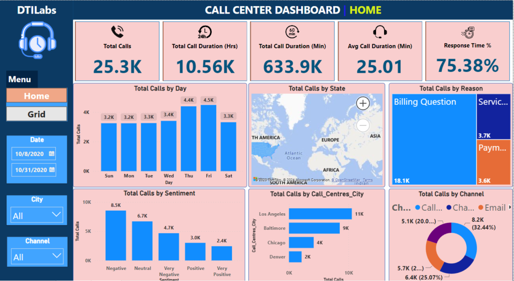
According to the BRD document, client specifically asked us to create two different dashboards one with Home and one with Grid menu which will allow users to export the data in the form of excel sheet. All the KPIs and Charts are also specifically mentioned. You can read the BRD document for more details here.
Software and Tools Used: MS Excel, Power BI, SQL Server.
The Call Center dataset has more than 32k records provided by client. They asked us to get this data from SQL Server. Each record in the dataset is a individual call of a customer. The Id column in the dataset acts as a Primary column. The Csat Score column is nothing but a customer satisfaction score.
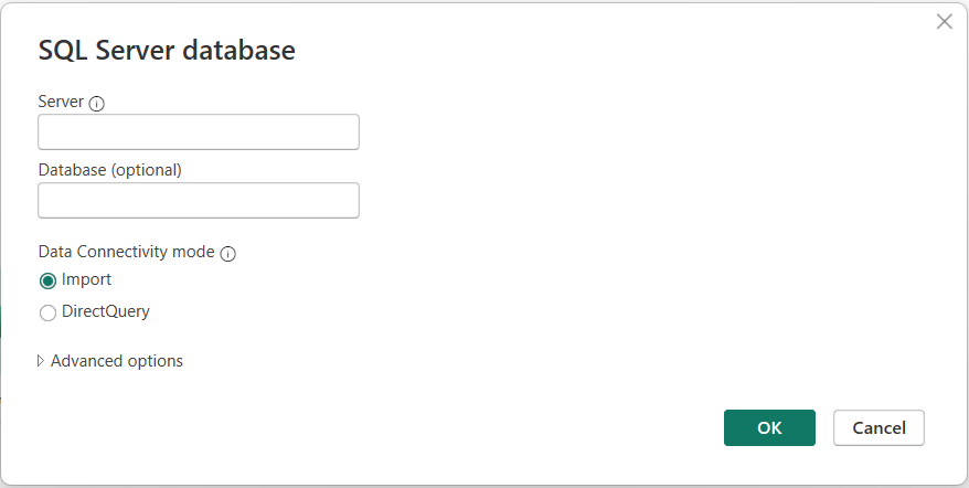
Data Gathering
For this project we will take data from SQL Server. Go to the ‘Get Data’ option in Power BI Desktop, select SQL Server. It will ask you for server name and database name (feel free to use import mode or direct query mode here). It will also ask for credentials which you have to provide to access the database.

After selecting the dataset and loading it into Power BI, We need to bring it into Power Query Editor to do some transformations. As our data is in only one large table, we don’t have to worry about separate fact table or dimension tables. Our data in Power Query looks 100% valid. If there is any changes needed go ahead and do those changes. Now we will just Apply and Load the file into Power BI Desktop.
Remember one thing that it is always a good practice to create a separate Date Master table (Calendar table). Let’s create a new Date table and name it as DataMaster table. Click on New Table option in Table View menu.
DateMaster = CALENDAR(MIN(Center_Call[Call_Timestamp]), MAX(Center_Call[Call_Timestamp]))Year = YEAR(DateMaster[Date])Day = FORMAT(DateMaster[Date], "DDD")Data Modeling
Now make the relationship between these two tables DateMaster and Center_Call. Go to the Model View Menu and do the modeling task based on common columns in both the tables. The relationship should be One-to-Many.

Go back to the Report View menu, and now set the Canvas settings vertical alignment as middle.
Before start creating the report, I would advice you to work on Mockup preparation because designing the report will eliminate the chances of error and it will save time as well. For me I want to put some images on my report. Also I want to keep filters on left hand side of the visuals on report for the easy access and title to the report.
DAX Calculations
According to BRD document our first requirement is ‘Total Number of Calls’ over period for KPIs. So create the new measures for it.
Total Calls = COUNT(Center_Call[Id])Total Call Duration (Min) = SUM(Center_Call[Call_Duration_In_Minutes])Total Call Duration (Hrs) = [Total Call Duration (Min)]/60Avg Call Duration (Min) = AVERAGE(Center_Call[Call_Duration_In_Minutes])For Response Time Percentage column we need to consider only ‘Within SLA’ and ‘Above SLA’ values. ‘Below SLA’ value cannot be consider for response time. Don’t forget to convert this measure into percentage.
Response Time % = CALCULATE([Total Calls], Center_Call[Response_Time] = "Within SLA" || Center_Call[Response_Time] = "Above SLA") / [Total Calls]Dashboard Creation
Now we have created all the measures mentioned in KPIs requirement. Let’s put it into visuals. We will use New Card Visual to show the measure values. Also you can create the below column in DateMaster table to sort the week days by order.
Week Day = WEEKDAY(DateMaster[Date])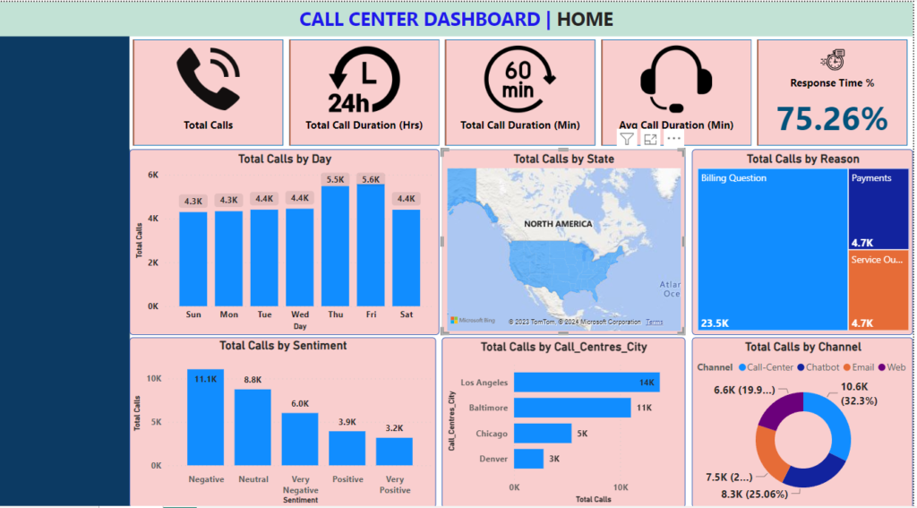
Clearly there are some changes needed. We need to enhance the UI a little later. Images looks very big, we need to adjust its size. Further create the filters for Date, City, and Channel columns and put it on left hand side of the visuals.
Create the second dashboard and name it as Grid. Put table visuals in it and try to convey calls information according to the BRD requirements.

Now we just have to add the buttons to navigate through this two dashboard pages.
At last you can export your Grid data in CSV file. I hope this article must help you to understand the dashboard creation process in Power BI Desktop. Always remember, DATA MAKES YOU RICH.